skip to main
|
skip to sidebar
Thursday, November 19, 2009
it's bigger on the inside!
Boo to the naysayers. I like the new logo.
Tardis shaped initials!
(Which is the best part, and better than the current logo. Boring!)
Newer Posts
Older Posts
Home
Subscribe to:
Posts (Atom)
shows
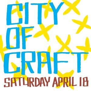
city of craft, december 11, 12 & 13, 2015 @ the theatre centre
We are fans of Afternoon Tea, photography, books, music, cooking and making stuff.
Talk to us:
killsidekrafts(at)gmail(dot)com
instagram
@killsidekrafts
twitter
@killsidekrafts
Blog Archive
►
2014
(1)
►
April
(1)
►
2012
(5)
►
December
(1)
►
August
(2)
►
April
(2)
►
2011
(16)
►
September
(4)
►
August
(1)
►
July
(2)
►
June
(2)
►
April
(1)
►
March
(2)
►
February
(1)
►
January
(3)
►
2010
(25)
►
December
(1)
►
November
(2)
►
October
(1)
►
September
(3)
►
August
(3)
►
July
(1)
►
June
(3)
►
May
(2)
►
April
(4)
►
March
(1)
►
February
(3)
►
January
(1)
▼
2009
(10)
►
December
(3)
▼
November
(1)
it's bigger on the inside!
►
September
(1)
►
July
(1)
►
June
(3)
►
May
(1)
crafty comrades
art attic
carolanne graham
deadweight
kid icarus
make something
morico
needle book
Old Weston
rhya
send more mail
snap & tumble
www.
flick
r
.com
This is a Flickr badge showing public photos and videos from
killside krafts
. Make your own badge
here
.
killside krafts in stores:
Kid Icarus, Toronto
Renegade Handmade, Chicago, Illinois
Scout, Toronto
Wholly Craft, Columbus, Ohio
killside krafts etsy shop
past shows
city of craft spring, april 18, 2015 @ the theatre centre
.
february 8, 2015 @ the workroom
.
city of craft spring, april 26, 2014 @ trinity st. paul's united church
.
february 9, 2014 @ the workroom, 1340 queen st w
.
september 7, 2013 @ bookhou, 798 Dundas Street West
.
december 8 & 9, 2012 @ the theatre centre
august 18, 2012, Bloor Street from Dufferin to Montrose
april 21, 2012 @ trinity st. paul's church,
december 10 & 11, 2011 @ the theatre centre
december 3, 2011 @ St. Stephen-in-the-Fields
September 10 & 11, 2011: Renegade Craft Fair, Chicago
december 18 & 19, 2010 @ the theatre centre
december 4, 2010 @ St. Stephen-in-the-Fields
june 13, 2010 @ the workroom
february 7, 2010 @ the workroom